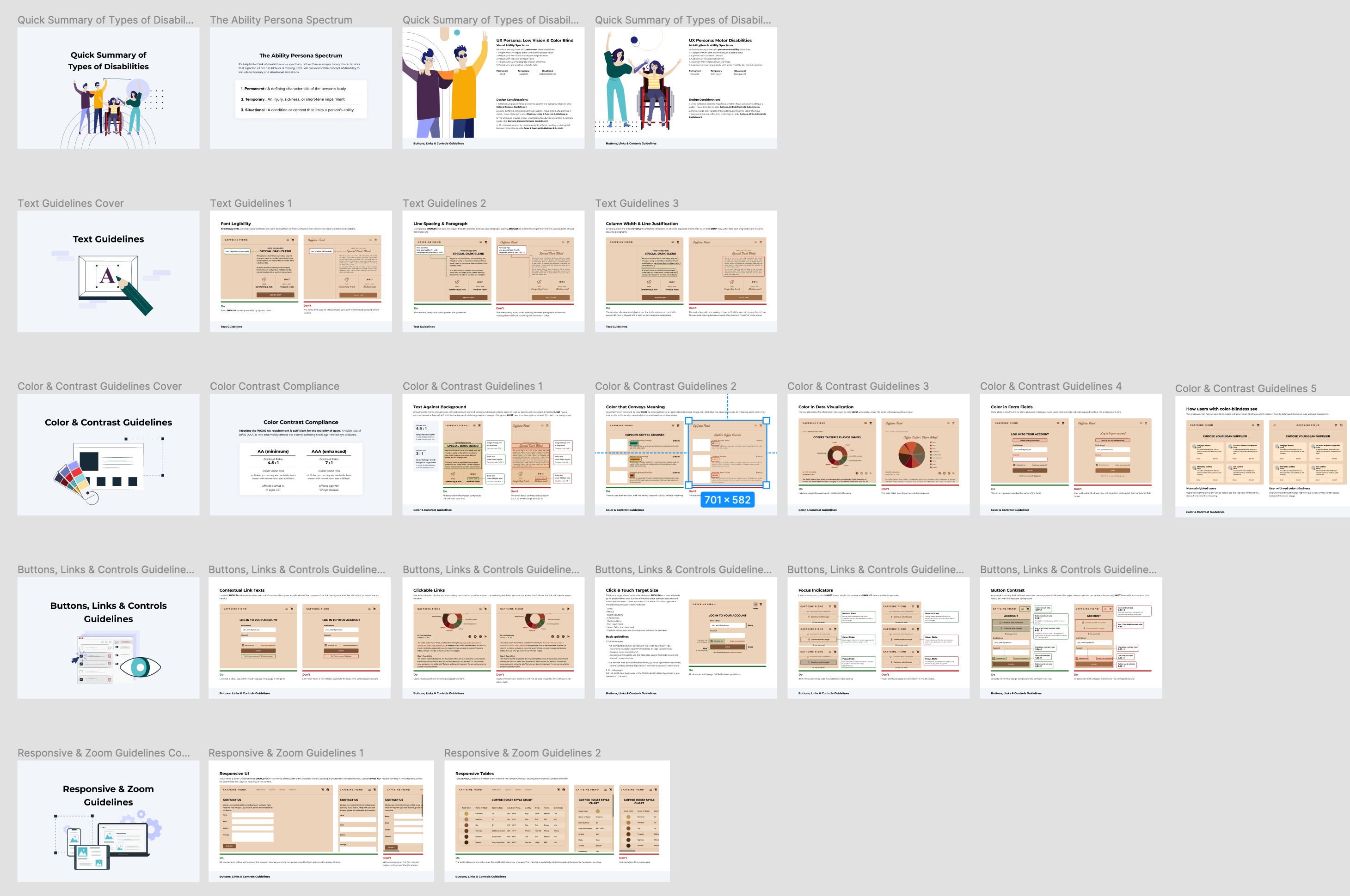
Configuring bare metal, without the outages
Designing network and port configuration for Equinix Metal’s on-demand cloud.
Our engineering customers manually configured network ports through a terminal and often misconfigured them, causing their cloud networks to go down. They were frustrated by the outages and wanted Equinix to fix the configuration experience.
Lead Product Designer
- Led product design and UX research.
- Facilitated workshops with customers and internal engineers.
- Designed network configuration experiences for bare-metal cloud.
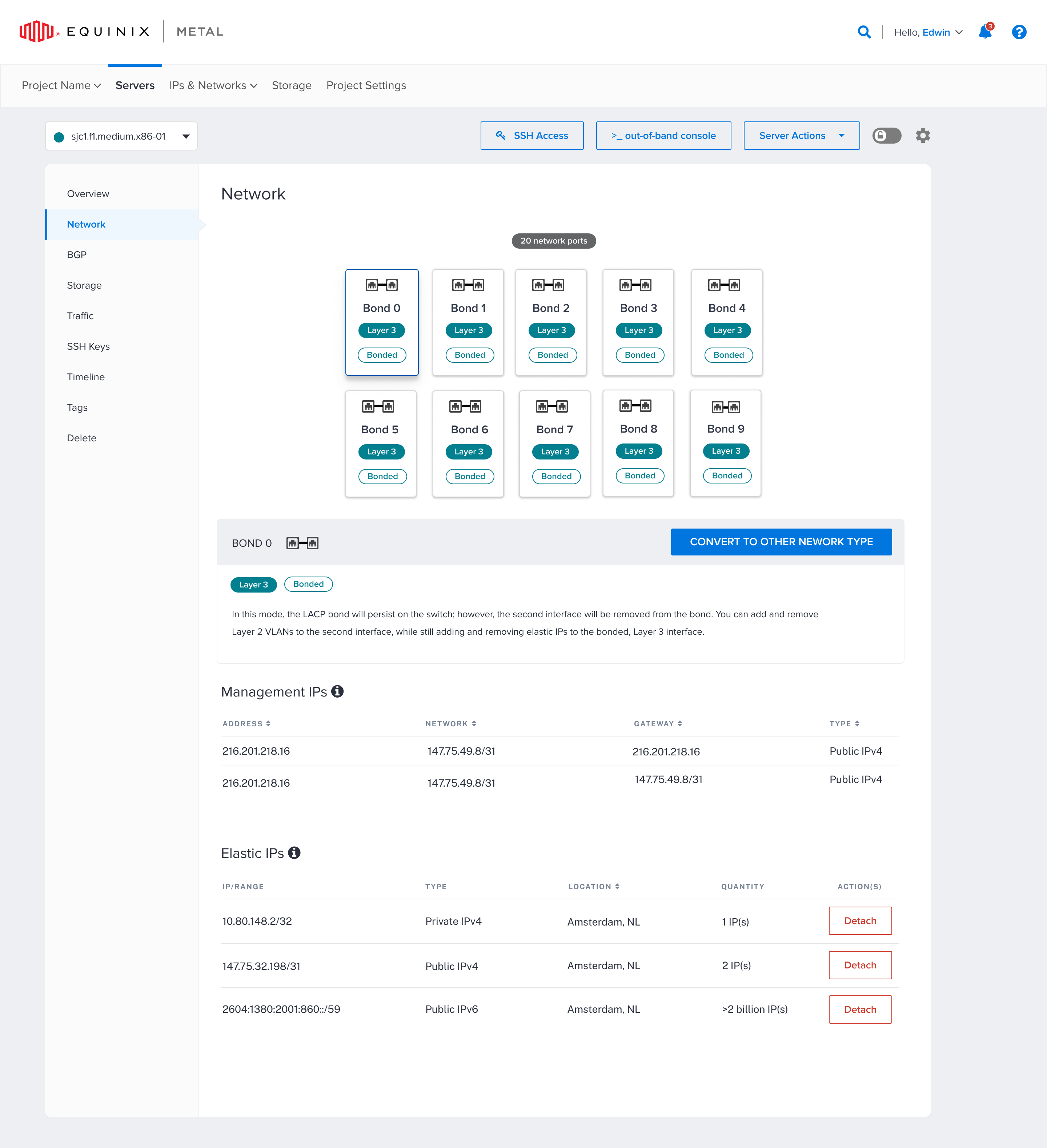
A closer look at the experience.
I led the customer research and product redesign that retained enterprise accounts with a combined value of multiple millions of dollars, as confirmed by sales. Across customer conversations and surveys, multiple engineering customers reported saving at least three days of configuration work with the visual UI compared with manual terminal setup. Customer feedback, support reports, and analytics also indicated fewer configuration-related outages.
Want to see how we got there?
Lead Product Designer
- Led product design and UX research.
- Facilitated workshops with customers and internal engineers.
- Designed network configuration experiences for bare-metal cloud.
About the project
Equinix Metal is on-demand bare-metal cloud. Customers rent a physical rack, then configure its network ports through a terminal to expand their cloud capacity. I owned the visual interface designed to make port configuration clearer and reduce the risk of mistakes.
The problem
Our engineering customers manually configured network ports through a terminal and often misconfigured them, causing their cloud networks to go down. They were frustrated by the outages and wanted Equinix to fix the configuration experience.
Equinix had assumed customer engineers could configure the network through a terminal without further guidance. Customers wanted to see their ports and configuration clearly, and outages damaged their confidence in the service. Major enterprise customers were considering canceling their accounts.
Discovery & research
To understand what was really going wrong, I built relationships with customer success to speak directly with customers, and stood up surveys and analytics with Appcues, Gong, and Fullstory to read sentiment and behavior.
The product: Bare Metal Cloud
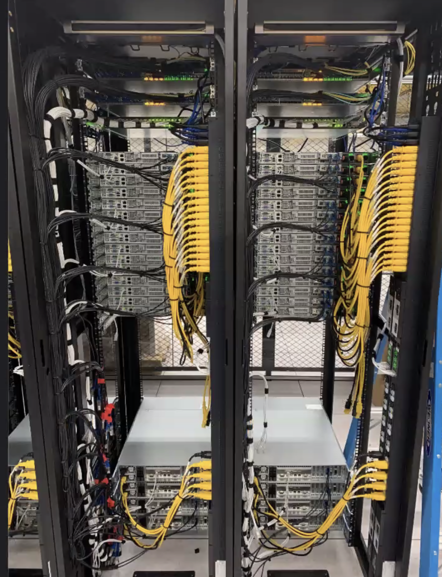
I wanted a deeper understanding of our users’ goals, needs, and behaviors, so beyond talking with them I went to look at the hardware itself. A customer rents this rack, then uses a terminal to configure the ports, which increases their cloud space. My job was to design the UI to make that easy and cause fewer user errors and outages.
Customer workshop
I facilitated a workshop where internal engineers and engineering customers sketched together to understand the tech, the issues, the limitations, and ideal solutions we could actually implement. My PM, manager, and VP joined to listen and learn.
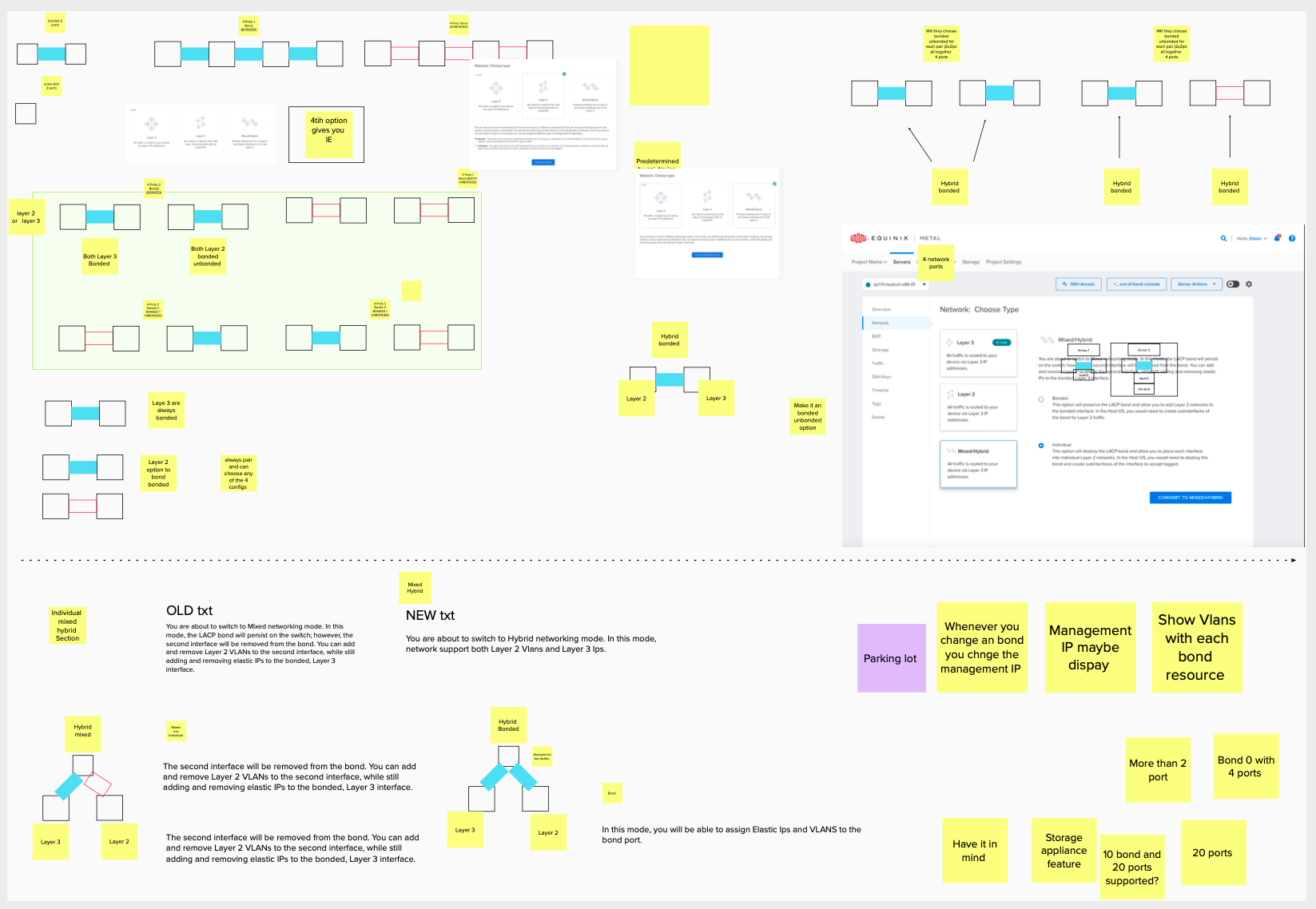
A few things we learned
Designs
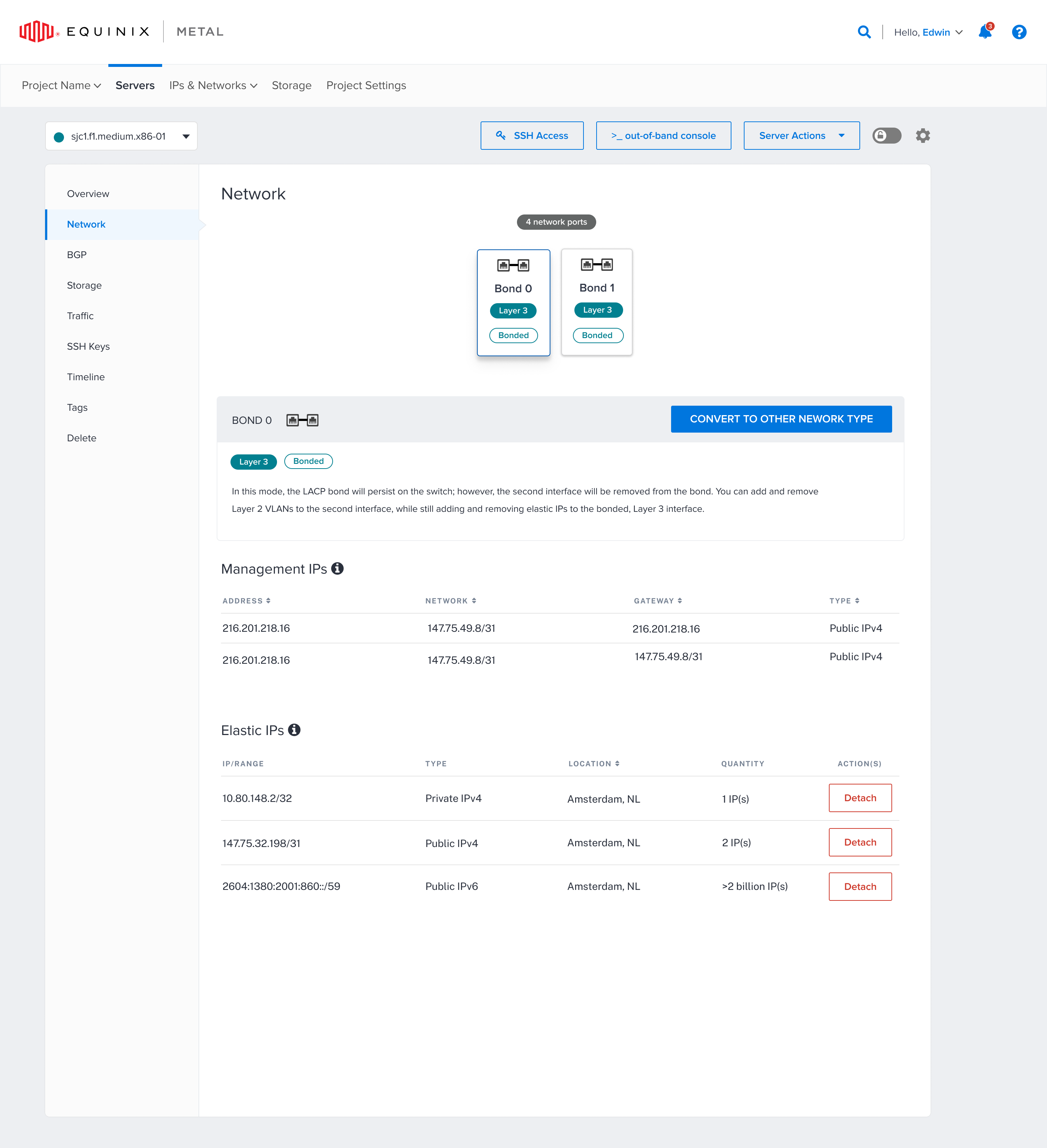
Ports, bonds, and layers were what mattered to users. It was important to display them clearly, with labels and port icons, no matter how many they were configuring. I made the content easy to understand so users always knew which layer they were configuring.
As we iterated, internal stakeholders wanted the cautionary messages to really stand out, and they’d happily comment on how easy the content was to understand.
Information architecture
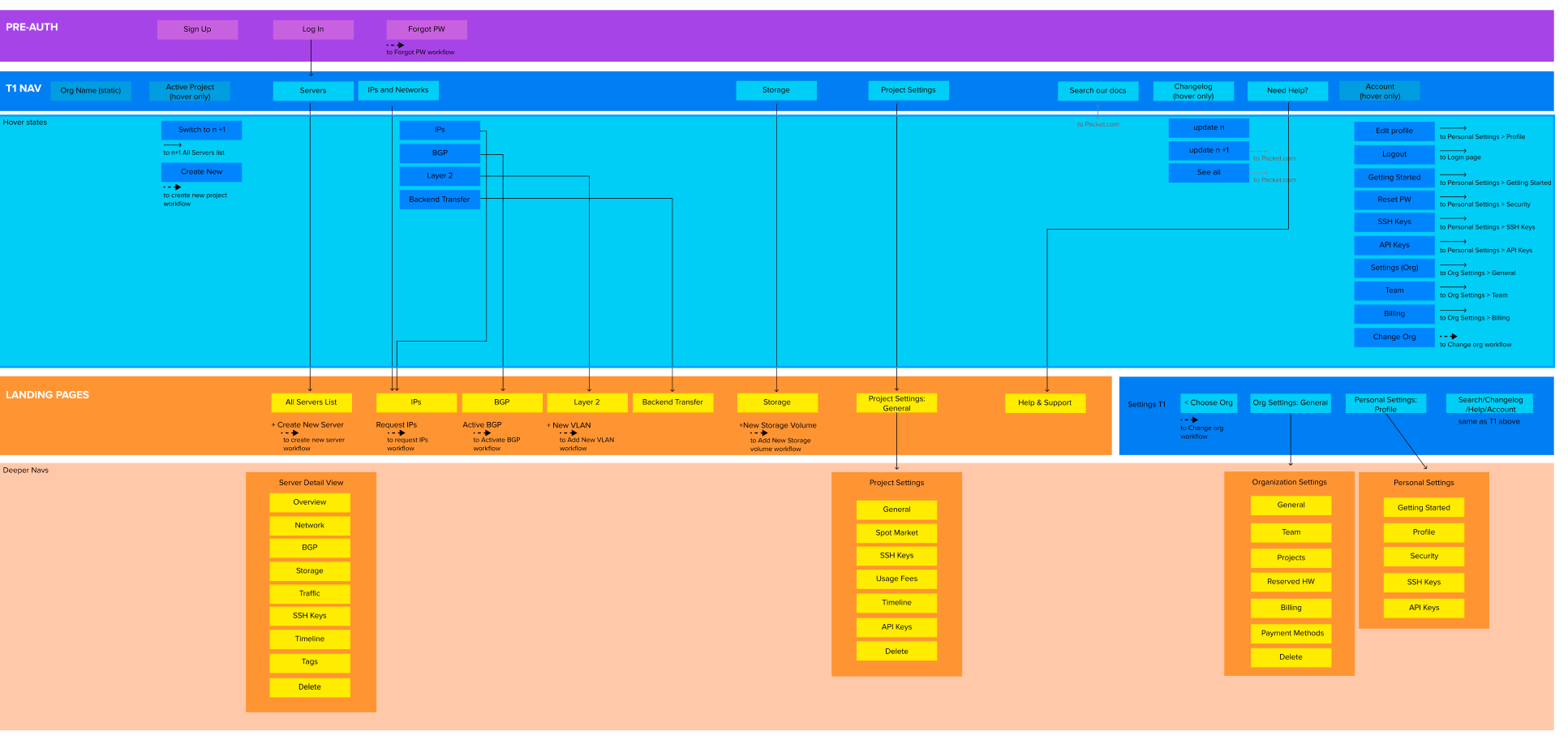
Network configuration and scaling
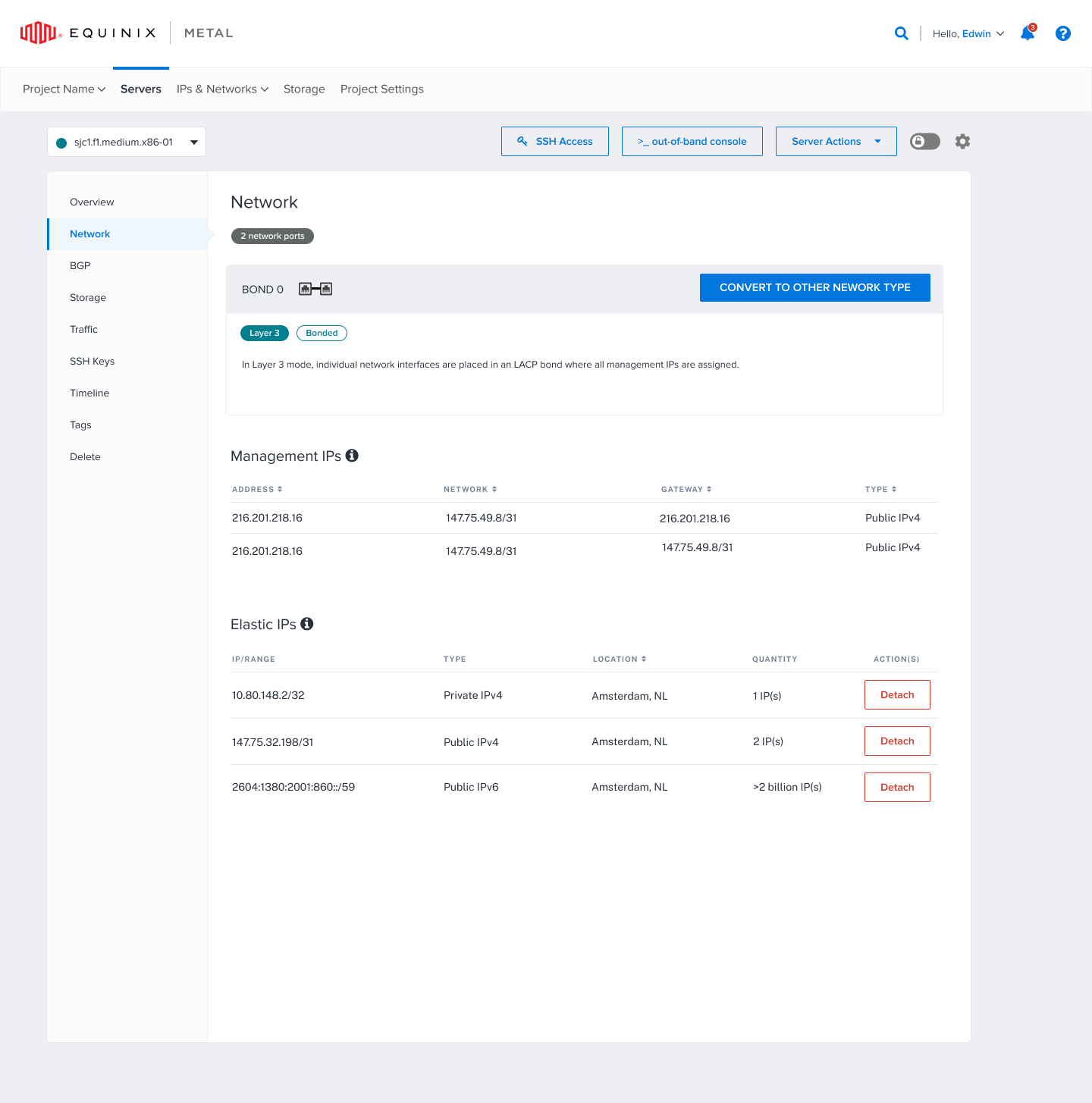
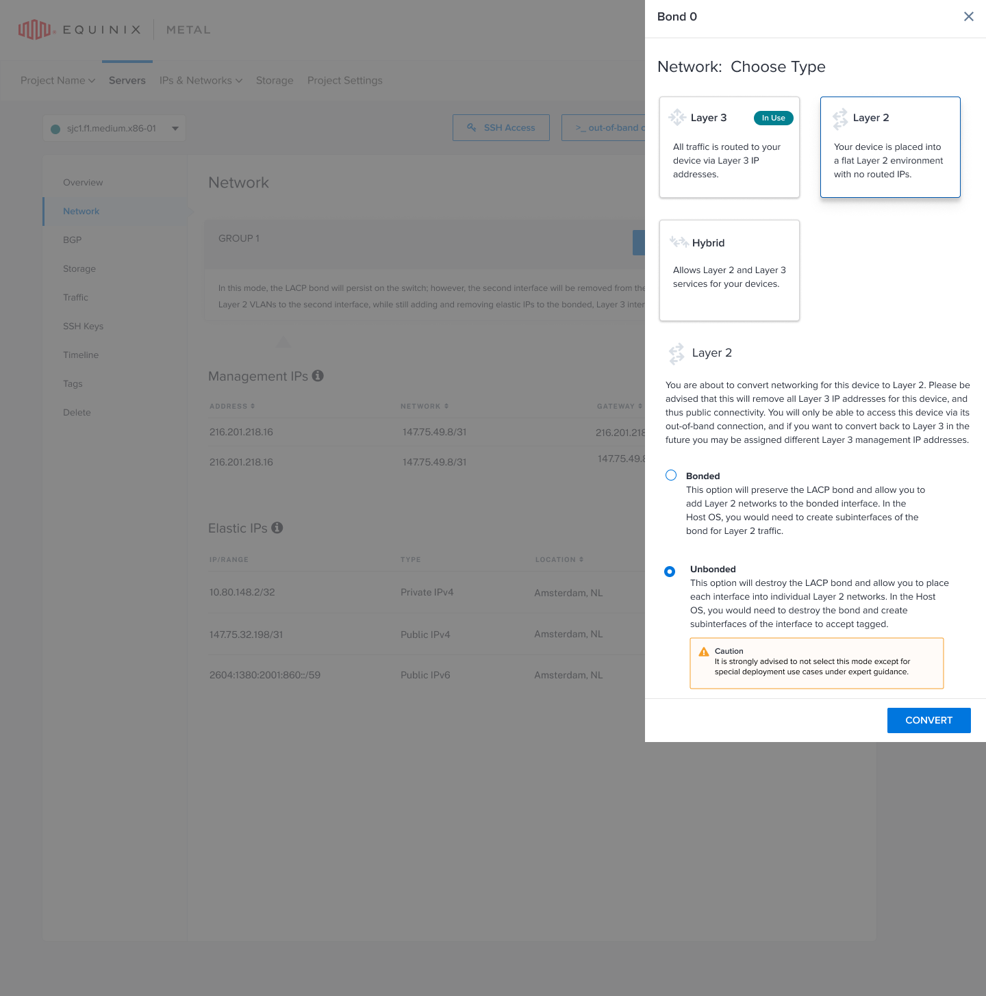
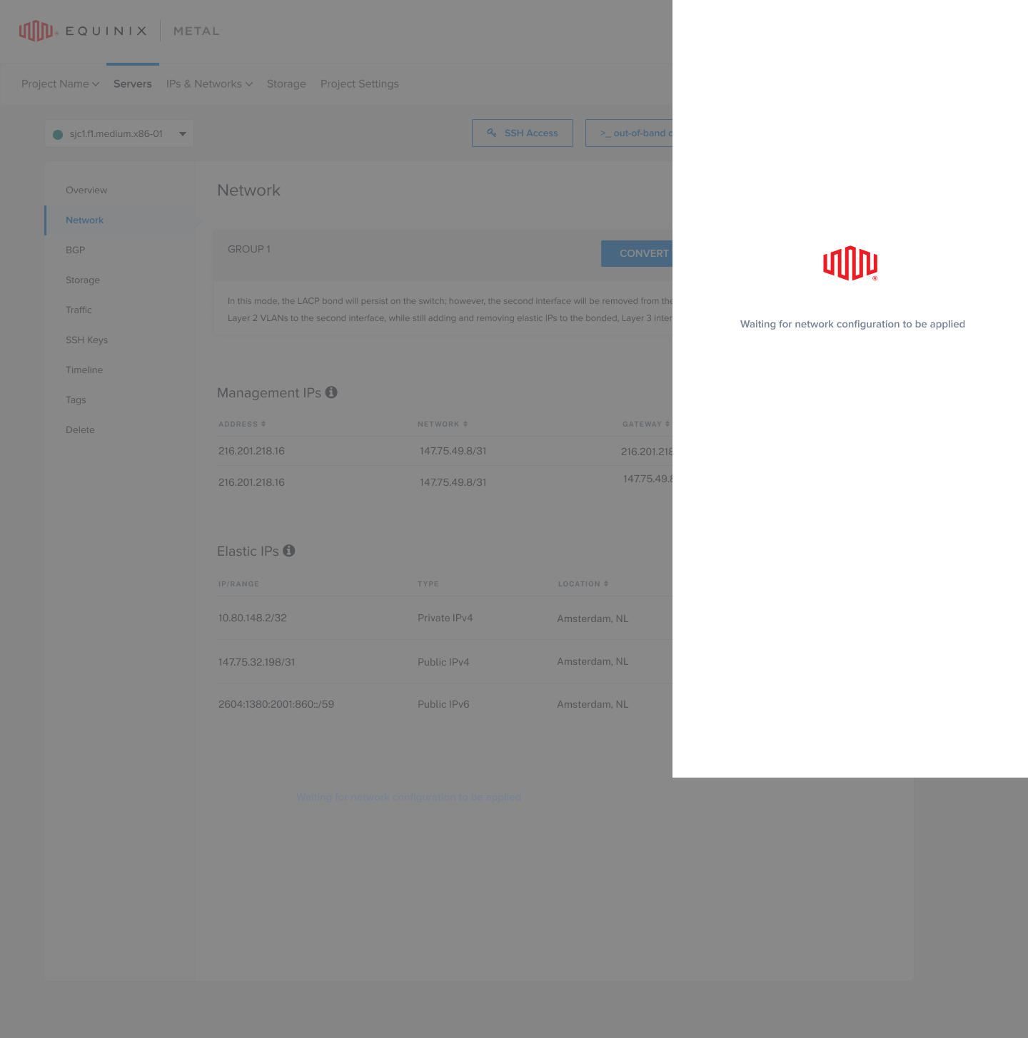
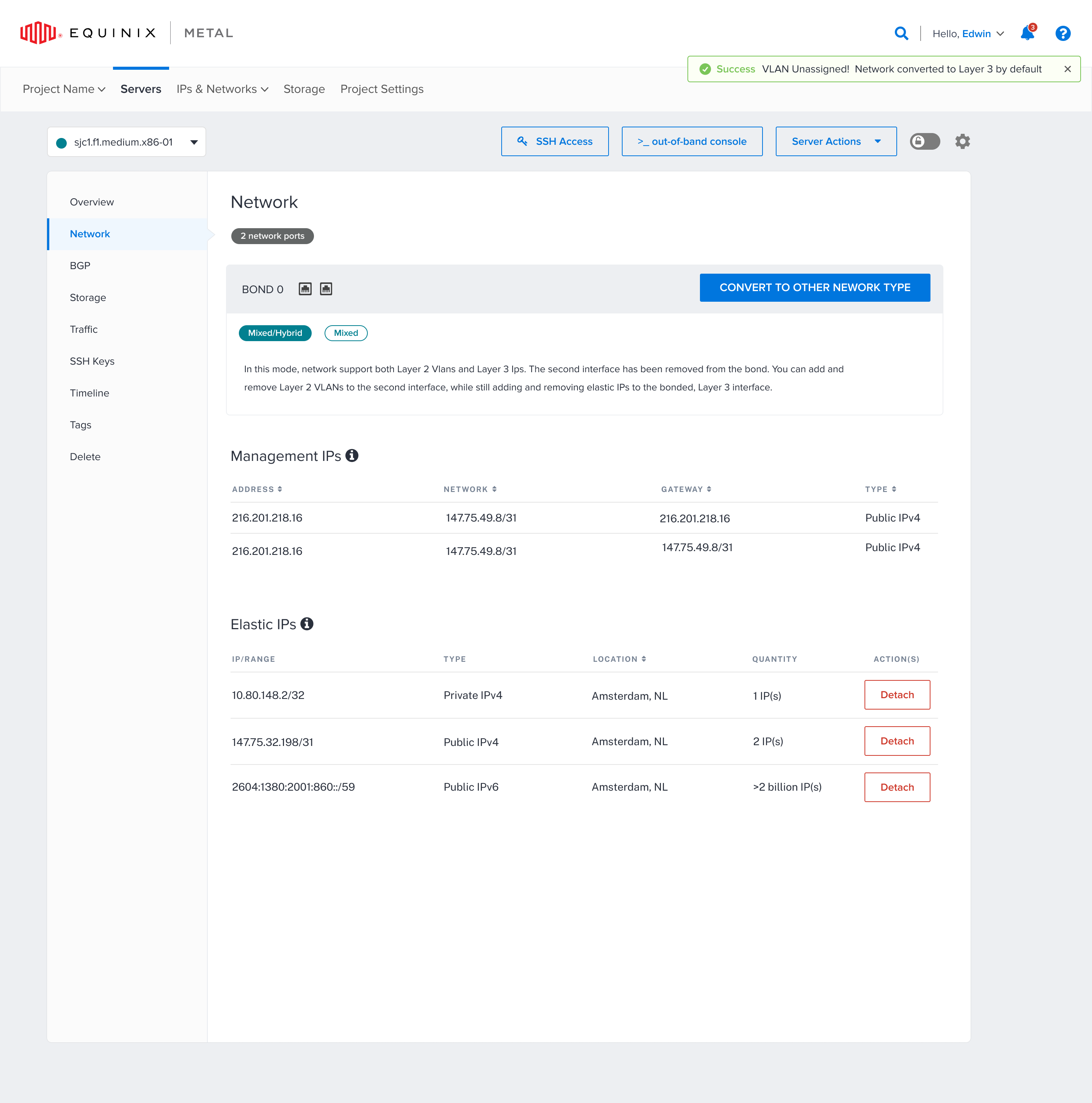
All six screens below shipped to customers. The interface supported a range of configurations, including four, eight, sixteen, and other port counts.
My design decision: support variable port and bond counts in one consistent layout, rather than design around the team’s original four-port assumption. The examples show four ports grouped into two bonds and twenty ports grouped into ten bonds. Clear labels showed each bond’s network layer and status, with the selected bond’s details below.
Results & impact
Across customer conversations and surveys, multiple engineering customers reported saving at least three days of configuration work with the visual UI compared with manual terminal setup. Customer feedback, support reports, and analytics also indicated fewer configuration-related outages.
of configuration work saved, reported by multiple customers in conversations and surveys
retained through the research and redesign I led, as confirmed by sales
analytics I introduced and more frequent customer conversations
Fewer configuration-related outages
Customer feedback, support reports, and product analytics indicated fewer configuration-related outages after the visual interface shipped, compared with terminal-based setup.
At-risk enterprise accounts stayed
I led the customer research and product redesign that retained enterprise accounts with a combined value of multiple millions of dollars, as confirmed by sales. Customers and customer success also confirmed that the accounts considering cancellation stayed after using the new interface. The visual experience addressed customers’ need to see their ports and understand configuration, following frustration with terminal-based setup and outages.
Faster configuration
Across conversations and surveys, multiple engineering customers reported that terminal setup had taken about a week. They said the visual interface helped them identify and configure ports more quickly, saving at least three days of configuration work. Customers also said that being able to see the ports and their configuration visually made the process cleaner, simpler, and easier to understand.
Analytics
I introduced surveys and product analytics and advocated for more frequent customer conversations. Together, these gave the team a clearer basis for launch decisions and helped us learn and iterate more quickly.
Internal stakeholders
Stakeholders saw the value of UX firsthand, driven directly by customer responses and feedback.
Other mentions: design system
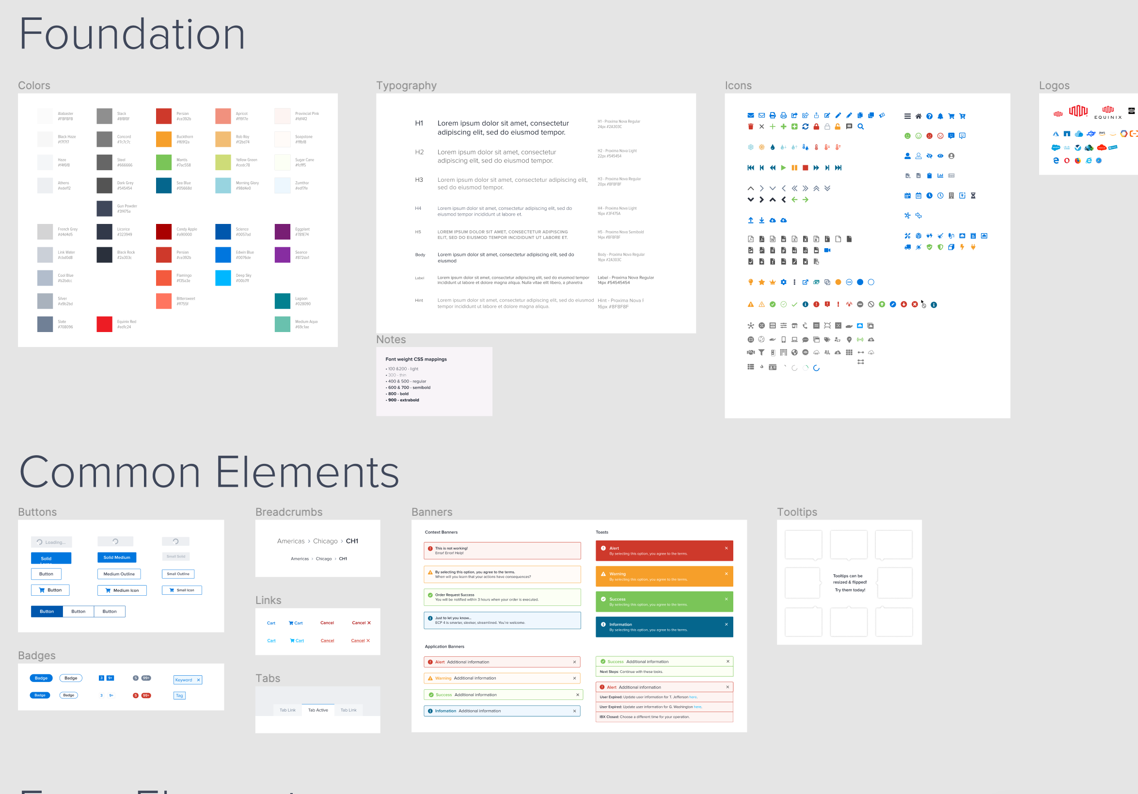
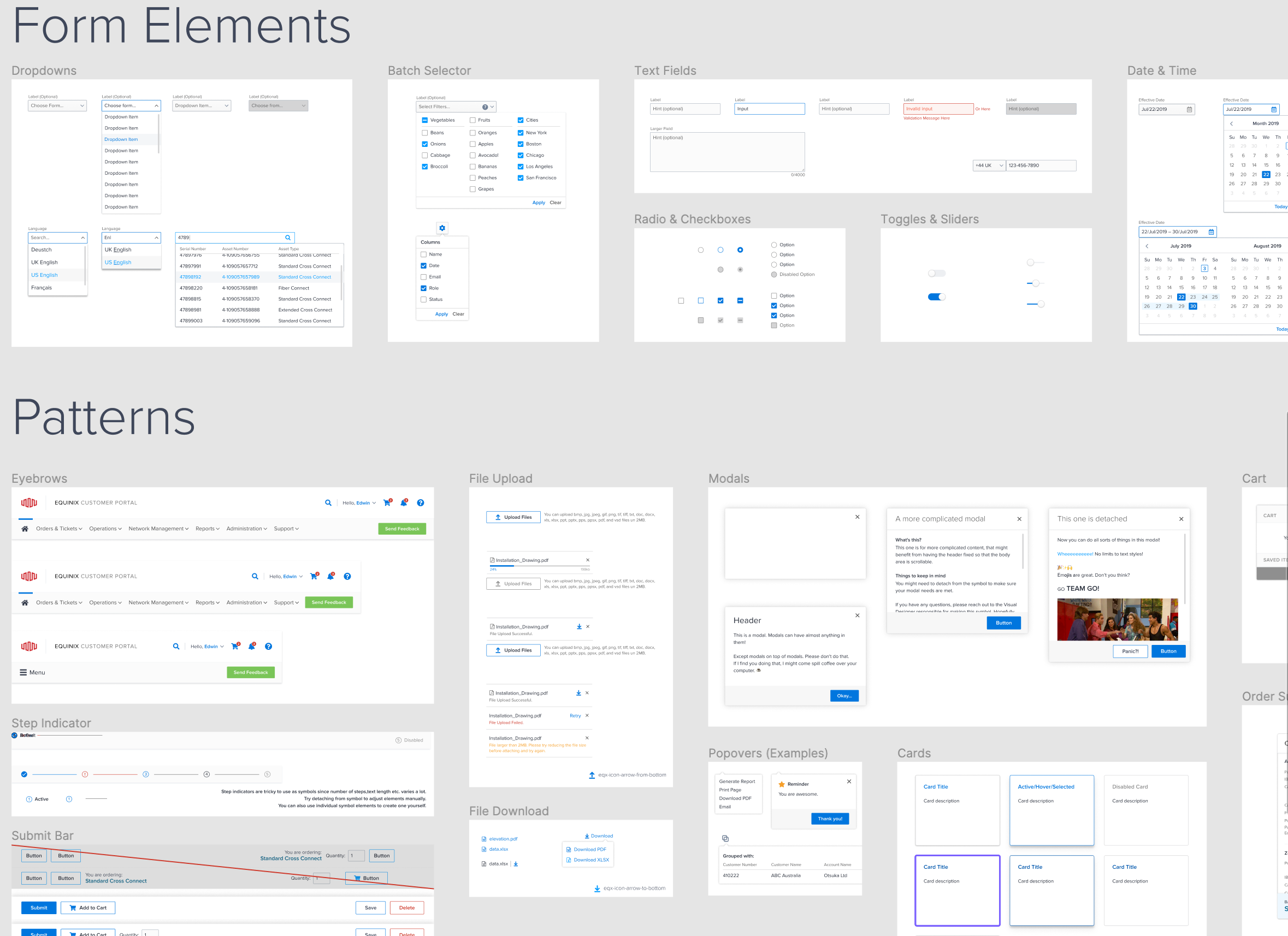
I noticed the design system for this product was in shambles. Another designer and I organized it, updated and created new components, and worked with engineering to implement them, then shared it with other teams in Europe and Latin America.
Other mentions: accessibility
As we progressed, I created an accessibility guide to help my fellow designers and engineers think about accessibility and the best ways to implement it.